


spaces™:
Spaces™ is a dynamic company that combines the fields of real estate, architecture, and interior design to create environmentally responsible and functionally efficient environments. Their mission is to shape the future of living and working spaces, approaching each project as a unique opportunity to enhance people's interactions with their surroundings.
The company undertakes a wide range of projects, including residential homes, commercial buildings, and public spaces, with a team of experienced professionals. They handle every aspect of each project, ensuring a hassle-free experience for clients.


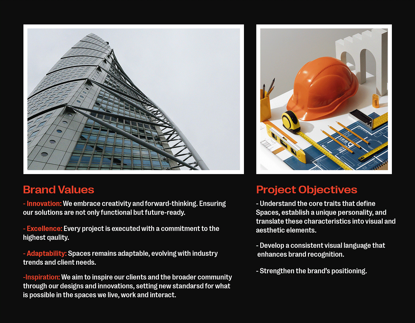
Research and Brand/Project Definition:
As the lead designer for the Spaces™ project, I began by conducting thorough research and defining the brand and project in detail. This phase was crucial in understanding the company's core values, personality, target audience, intended tone of voice, and competition/market. The primary purpose was to ensure that the project outcome aligned with the brand's strategic objectives.
The different stages involved in this phase included brand immersion, competitive analysis, audience research, and strategy formation.
As a result, I gained adequate insights and was well-informed to design solutions that are visually appealing and strategically sound. This process ensured that my creative solutions would effectively contribute to the brand's success, enhancing its market presence and connection with the target audience.


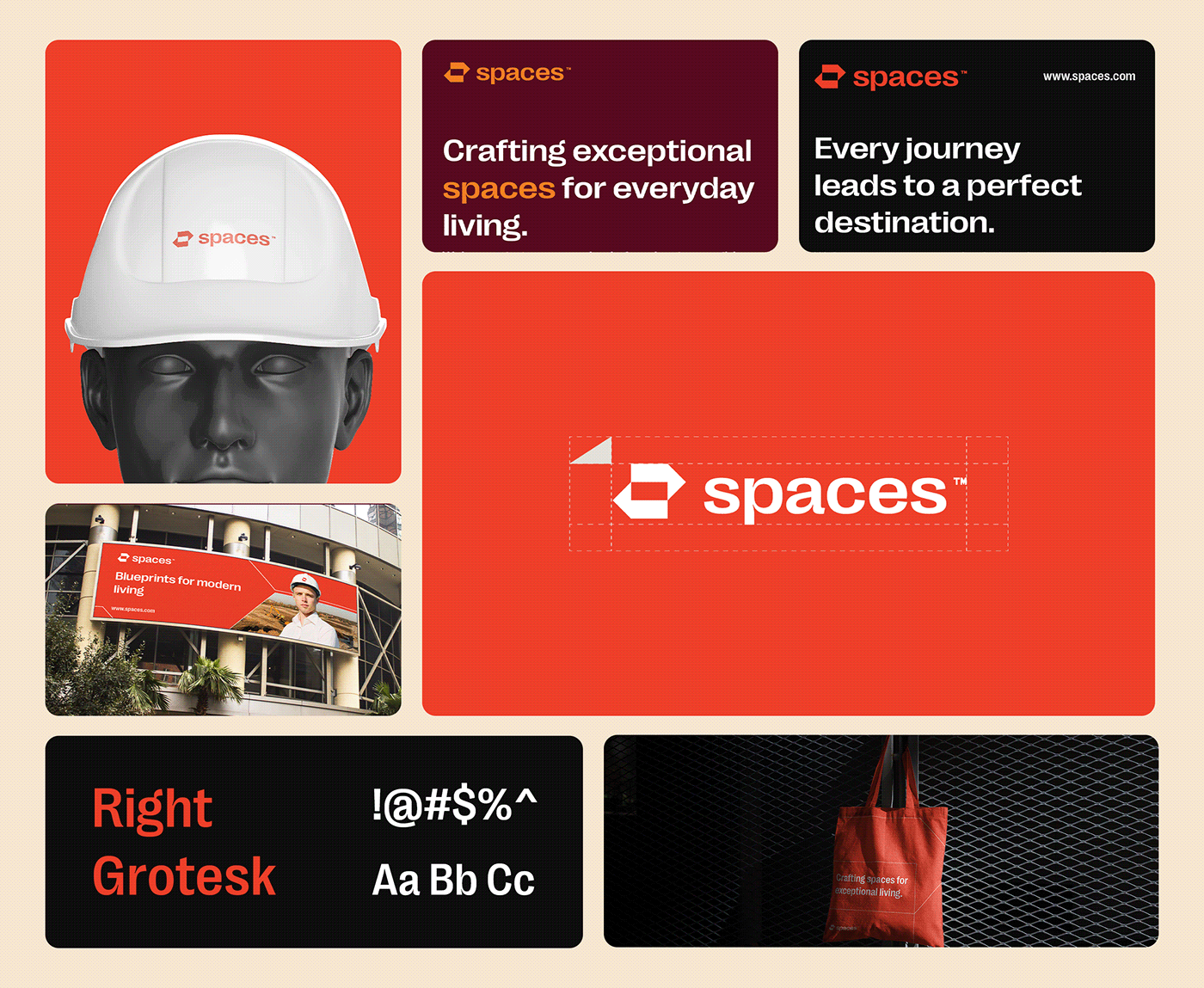
Logo Design Process:
Designing the perfect logo for Spaces™ was more than simply creating a symbol. It involved capturing the brand's essence and communicating its values, personality, and aspirations through a single mark. The logo serves as the visual cornerstone of the brands identity, ensuring that every element is purposeful and meaningful.
The concept development phase for the logo consisted of several stages, including ideation, refinement, digital rendering, typography, and color selection.


Defining Spaces™' Visual Language:
The choice of typography and color palette played a crucial role in creating a compelling brand identity for Spaces™. These elements complemented the design and effectively communicated the brand's values.
To select the typography, I considered the functional aspects such as readability, legibility, and scalability. I chose a typeface that could perform well across different platforms and sizes, from large-scale signage to mobile screens. I also took into account alignment with the brand's personality and the type distinctiveness.
The color palette selection was influenced by the psychological impact of colors on consumers. I chose colors that could evoke emotions and reactions suitable for the brand. I also considered the representation of brand values.


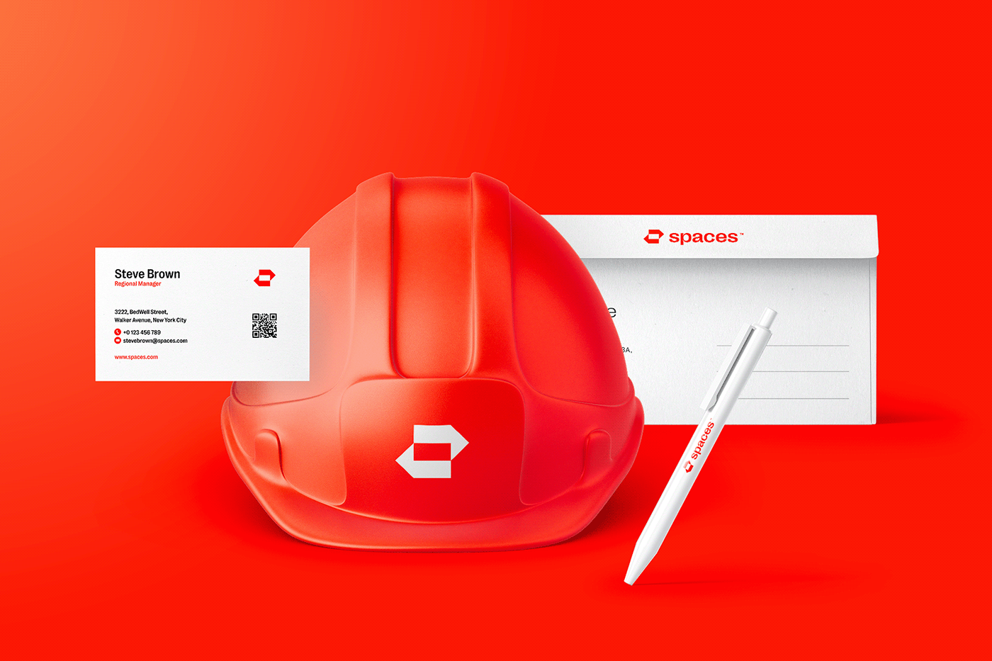
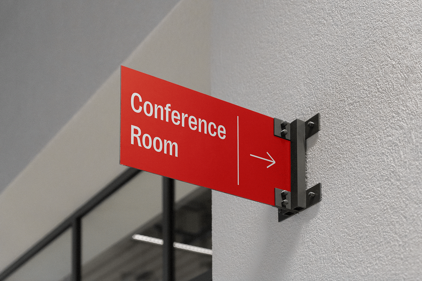
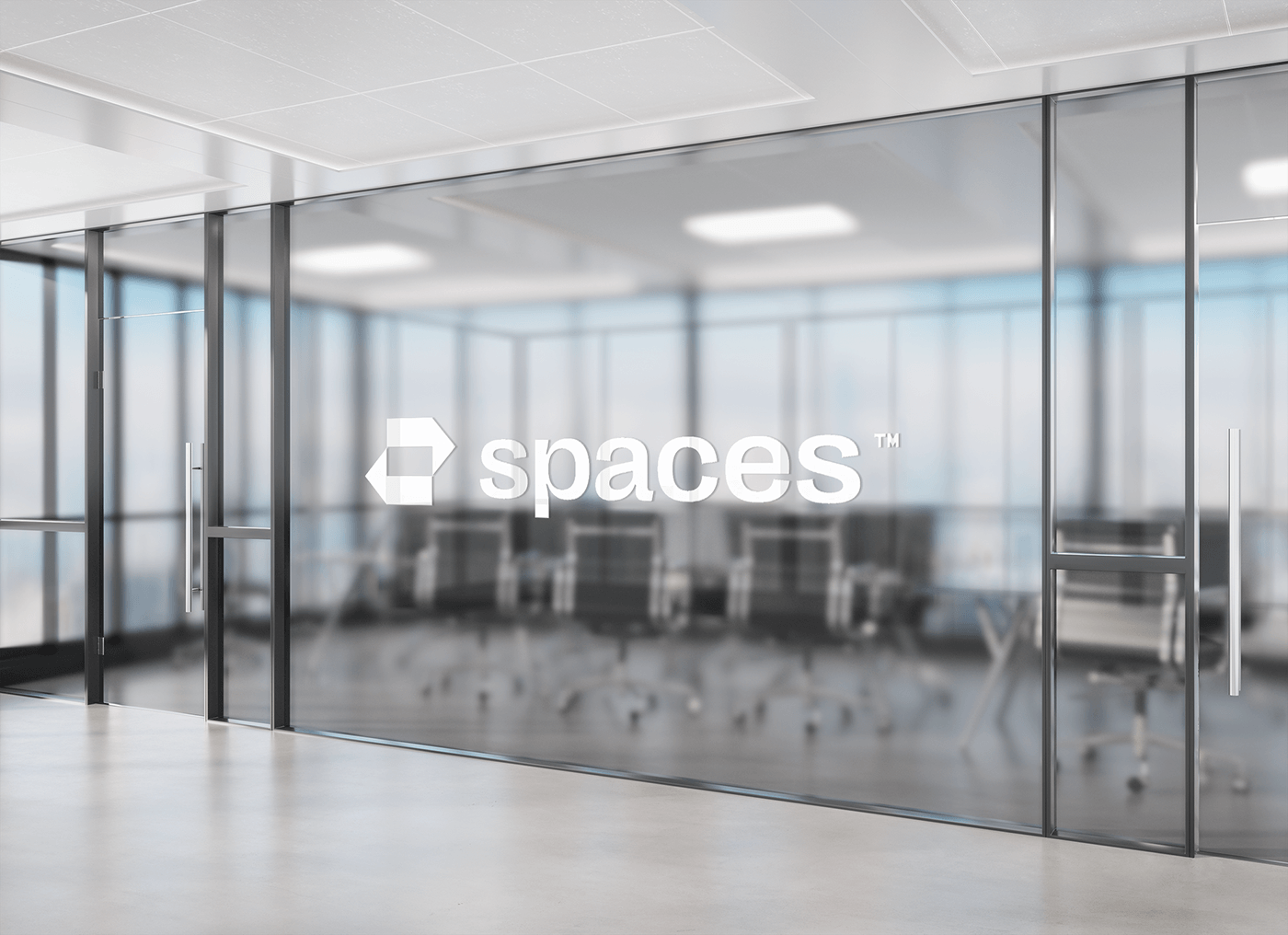
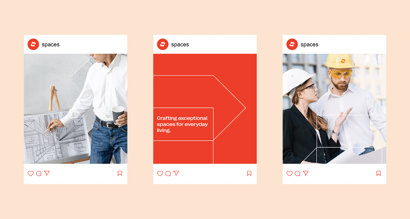
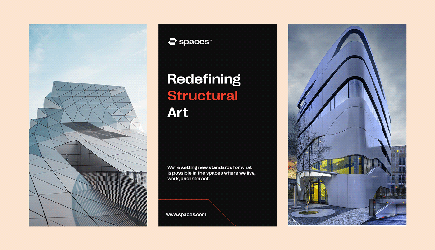
Bringing the Spaces™ Brand to Life:
Bringing the brand to life involved implementing the brand's visual identity consistently across all touchpoints and collateral. This ensures that every element, from business cards to print and digital interfaces, not only looks visually appealing but also effectively communicates the brand's message. To achieve this consistency, I made sure to create detailed guidelines covering the use of the logo, color palette, typography, imagery, and the overall tone of voice of the brand.


Are you interested in working with me?
Please reach out to me via email here:
You can also connect with me on social media
THANK YOU FOR WATCHING


